When a practice decides to standardize its scrubs, the fabric and the embroidery get all the attention, but the decision that patients and staff actually notice every day is color. Assign colors well and a walk down the hallway tells you who is a nurse, who is a surgeon, and who to ask for help. Assign them carelessly and you have spent a uniform budget on confusion. This is a guide to building a scrub color policy that works, starting from an uncomfortable fact: almost none of it is standardized for you.
There is no national scrub color code
It is tempting to assume hospitals share a color system the way road signs share shapes. They do not. Color assignments vary from one facility to the next, and beyond a couple of loose conventions there is no governing standard telling you that a given color means a given role. That is not a problem to solve so much as a reality to design around. It means your practice gets to define its own scheme, but it also means you cannot assume a new hire arrives already knowing what your colors mean. The policy has to be explicit, written down, and taught.
The one place a stronger convention exists is the operating room, where surgical staff have long worn green or blue. The reason is optical rather than arbitrary: staring at red tissue for hours creates a green afterimage, and green or blue-green scrubs sit opposite red on the color wheel, which reduces that visual fatigue and helps surgeons distinguish subtle shade differences. Outside the OR, the meanings get softer fast, and even the familiar blue-for-nurses and white-for-doctors pairings are conventions rather than rules that any two hospitals are guaranteed to share.
The conventions people actually expect
Even without a standard, some associations are common enough that patients half-expect them, and it is worth knowing which ones carry weight before you assign against them. A few pairings show up almost everywhere; many others are genuinely a coin flip between facilities.
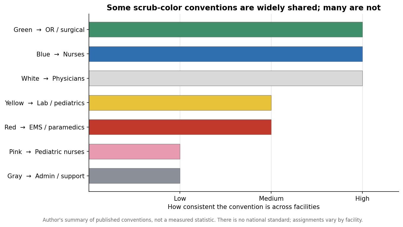
The practical lesson is to lean on the strong conventions and treat the weak ones as free choices. Putting your nurses in blue and your surgical team in green costs nothing and matches what people already anticipate, which quietly reduces friction. Assigning pink to your billing department, on the other hand, will not confuse anyone, because there is no widespread expectation to violate. Reserve your deliberate, distinctive color for the role you most want patients to identify on sight, and let the rest follow convention or convenience.
How many colors your practice actually needs
The most common mistake in scrub programs is buying too many colors, not too few. Every additional color multiplies the sizing runs you have to stock, the reorder lines you have to manage, and the odds that someone shows up in the wrong shade. The right number of colors is driven by how many roles a patient or coworker genuinely needs to tell apart at a glance, not by how many look nice on a mood board.
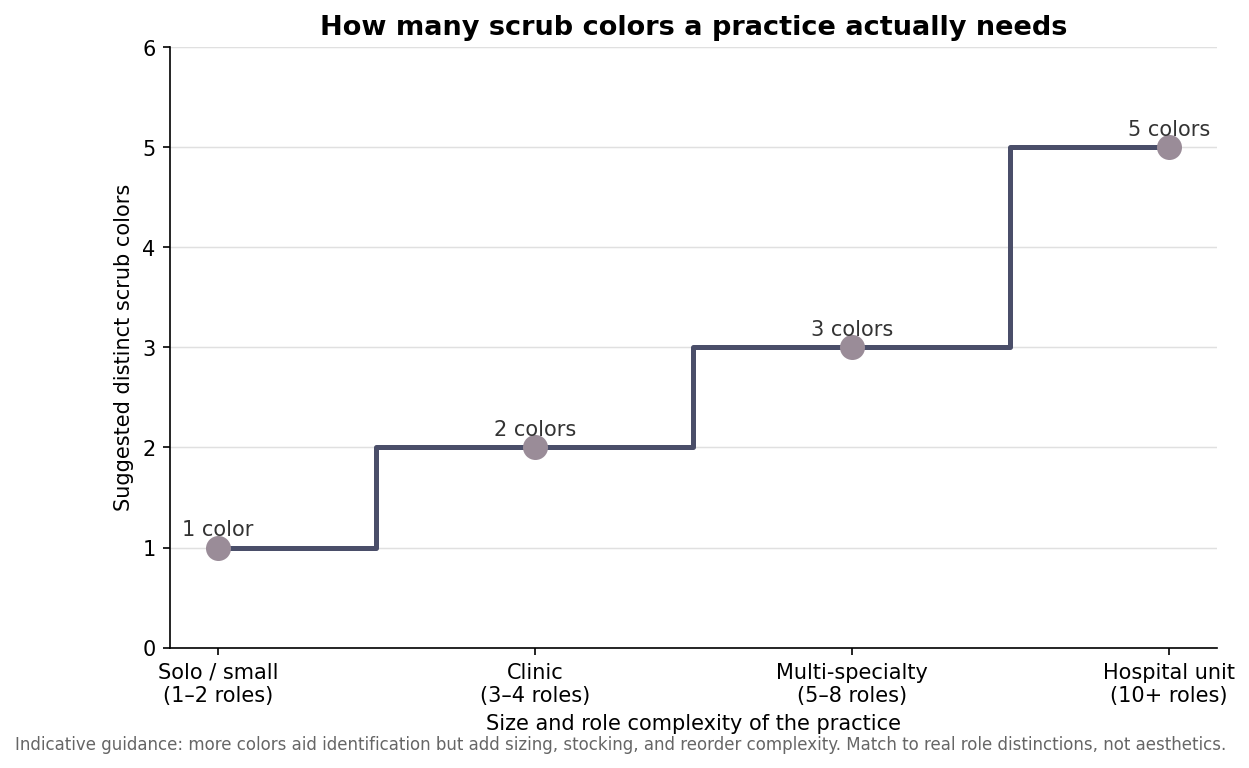
A solo practitioner or a small front-desk-plus-provider office rarely needs more than one color; the branding lives in the embroidery, not in a color-coding system nobody is trying to read. A mid-sized clinic with clinical and support staff benefits from two, maybe three, colors that separate the groups patients interact with differently. Only large, multi-role environments justify five or more color tiers, and even there the discipline is to map each color to a real, patient-facing distinction. When in doubt, use fewer colors and let name and role embroidery carry the finer detail. A tight palette is also cheaper to run, easier to reorder, and far more forgiving when a team grows or reshuffles, because you are not locked into a color scheme built around roles that no longer exist.
Making the policy survive contact with reality
A color policy is only as good as its consistency over time, and this is where custom programs quietly go wrong. Dye lots drift, so the “navy” you order this year may not perfectly match the navy from eighteen months ago; ordering a full size run at once, and specifying the same fabric and color name on reorders, keeps a team looking uniform rather than mottled. It also pays to hold a small buffer of common sizes so a new hire is not stuck in the wrong color for weeks waiting on a reorder.
Embroidery contrast is the other detail that makes or breaks the look. A logo has to be legible against the garment, which means a dark thread on light scrubs and a light or metallic thread on dark ones; a navy logo on black scrubs disappears at three feet. Decide your thread colors per garment color up front, and confirm them on a physical sample before committing the full order. The same goes for logo placement, which should be consistent across every color so the program reads as one uniform and not a collection of individual choices.
Write it down and keep it short
The final step is the cheapest and the most skipped: put the policy in writing. A single page that states which role wears which color, where the logo sits, what thread color pairs with each garment, and how to reorder will outlast any individual manager and keep the program coherent as the team turns over. Color is the part of a scrub program that does the most communicating and gets the least planning. Give it a deliberate structure, keep the palette tight, and the uniforms will do their quiet job of telling everyone, at a glance, exactly who is who.
Leave a Reply