A logo on a scrub top has a hard job. It has to read across a busy exam room, survive dozens of hot industrial wash cycles without puckering or fraying, and sit somewhere a clipped ID badge will not cover it. Settle the placement, size, and artwork before the order reaches production and the same file will reorder cleanly for years. Leave them vague and you find out what went wrong only after a sealed box of finished tops arrives. This is a practical walkthrough of the specifications a decorator actually needs from you, and the reasoning behind each number.
The order matters: decide where the mark lives, then how big it is, then how the file is built. Working in that sequence keeps you from sizing a logo that will not fit the space you eventually choose.
Start with placement, not the logo
The left chest is the default placement on scrubs, and it earns that spot. It stays visible while a clinician leans over a patient, it reads in a headshot or a hallway, and it clears the center of the collar where most staff clip an ID badge. Put a logo dead center and half the time a lanyard or badge reel hides it. The pocket is the other constraint. Many scrub tops carry a chest pocket exactly where a left-chest logo wants to go, so confirm whether your mark sits above the pocket seam or on the opposite side before you commit.
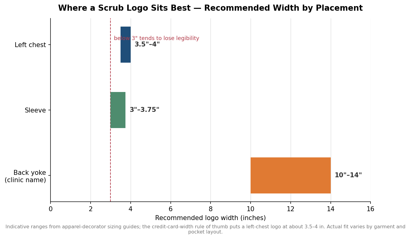
Secondary placements each answer a different need. A small icon on the sleeve reads as a modern, understated touch and works when the chest is already busy. A wider mark across the back yoke, just below the collar, is where a clinic name, department, or website belongs because it has room for legible text at a distance. Personalized names and titles usually sit directly under the left-chest logo, or balanced on the right chest, in a clean block font that holds up in thread.
Size it for legibility, then for the garment
A left-chest logo generally lands between 3.5 and 4 inches wide. The quickest gut check is to hold a credit card horizontally against the chest of a top: that width is close to right. Push much below 3 inches and fine detail starts to close up and text turns to mush once it is stitched. Circular marks tend to run a little smaller, around 2.5 inches, simply because a circle fills more of its bounding box than a wordmark does. Sleeve icons sit in the 3 to 3.75 inch range, and a back-yoke treatment for a clinic name typically spans 10 to 14 inches so the text carries across a room.
The single most useful rule concerns text: any lettering in the design should be at least a quarter inch tall in the finished stitch-out. Thread has a minimum feature size, and letters below that height lose their counters and gaps. If your logo includes a tagline or a long clinic name that would fall under a quarter inch at 3.5 inches wide, that is a signal to drop the tagline from the chest version and reserve it for the larger back placement.
Get the artwork into an embroidery-ready format
Embroidery does not read your logo the way a printer does. A machine follows a stitch file, so the artwork has to be converted first, and the quality of that conversion decides how the mark looks. Send vector artwork whenever possible: an AI, EPS, or SVG file scales without blurring and gives the digitizer clean edges to follow. A JPG or PNG can be used, but it usually needs to be cleaned up or redrawn first, which adds time. What you should never assume is that handing over a print-ready logo is the same as handing over an embroidery-ready one.
Digitizing is the step that turns that vector art into machine instructions. A digitizer assigns stitch types, satin stitches for borders and lettering, fill stitches for solid areas, running stitches for fine lines, then adds underlay to stabilize the fabric and pull compensation so the design does not distort as the thread tensions. This is also where design choices get enforced by physics. Gradients and subtle color fades cannot be reproduced in thread and must be simplified into solid color blocks, and very small elements often have to be enlarged or dropped. The common machine file, DST, was developed by Tajima and runs on virtually every commercial embroidery machine, but it carries no thread color information, so you should supply your thread color callouts separately rather than assuming they travel with the file.
Understand stitch count, setup cost, and turnaround
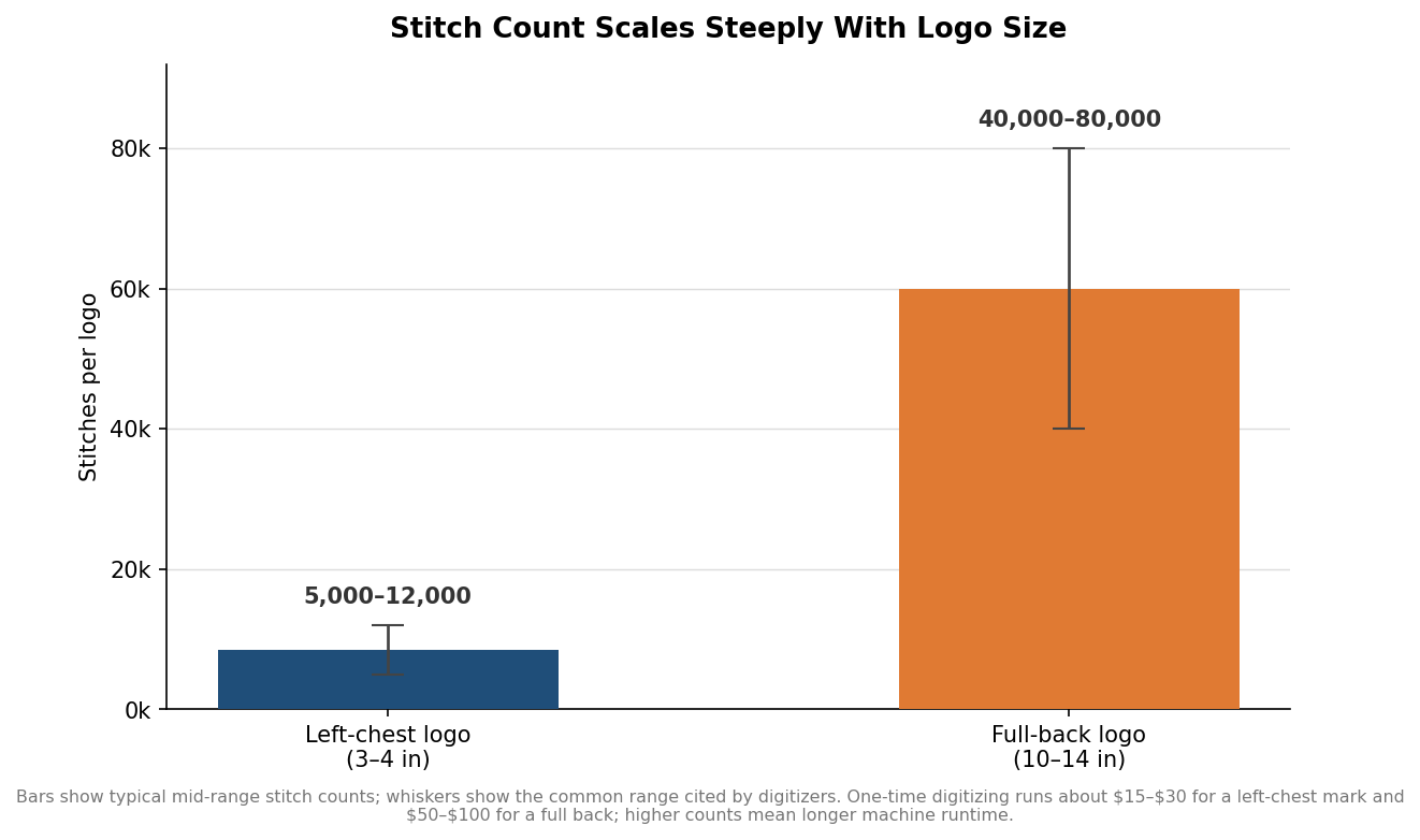
Stitch count is the hidden variable behind both price and schedule. A left-chest logo of 3 to 4 inches typically runs somewhere between 5,000 and 12,000 stitches depending on how much solid fill it contains. Scale that same design up to a 10 to 14 inch back and it can climb to 40,000 to 80,000 stitches, because density grows with area. More stitches mean longer machine runtime per piece, and every additional thread color adds a color change that slows the run further, which is why a simplified two or three color mark is cheaper to produce at volume than a busy one.
Digitizing is a one-time setup cost, not a per-piece charge. Expect it to fall roughly in the 15 to 30 dollar range for a straightforward left-chest logo and 50 to 100 dollars for a large back design, with the exact figure depending on complexity. Once a design is digitized, the file is kept on record, so reorders skip that fee entirely. Digitizing itself usually turns around within 24 to 48 hours, which matters when you are planning a launch date; it is the production run, not the file prep, that drives your real lead time.
Fabric and the last checks before you commit
The garment underneath decides how clean the stitching looks. A polyester-cotton blend with a tight, stable weave is the friendliest foundation because it holds the stitches without shifting. Very lightweight or highly stretchy performance fabrics are more prone to puckering around a dense design, so they lean harder on proper stabilizer and a digitizer who accounts for the stretch. Whatever the fabric, the color of the actual garment changes how thread reads, so a navy logo that looks sharp on white can disappear on a dark top.
Before you approve a full run, ask for a sewn sample, a physical stitch-out on the same garment and color you are buying, not just a digital proof. It is the only way to catch a letter that closed up or a color that vanished while it is still cheap to fix. Note the digitized file identifier your decorator assigns, keep it with your brand assets, and reorders will match the first batch exactly. In short, hand your decorator vector artwork, a chosen placement, a finished width in inches, your thread colors, and the specific garment, and most of the ways a scrub logo goes wrong are closed off before the machine ever starts.
Leave a Reply